Your website gives parents a way to learn about your practice before contacting your team. A family may arrive through a referral, a review, or a search, and the site should help them understand whether your services could be a fit.
Clear information and an easy path to contact your office give families a useful next step. Outdated details, slow pages, or confusing navigation can make that step harder.
What Parents Actually Look For
Parents searching for ABA, occupational therapy, speech therapy, or sensory integration services need practical answers. Can you help my child? Who provides care? How do I get started? Use those questions to guide the content on your homepage and service pages.
Make those answers easy to find with clear headlines, current photos of your space and team, and an obvious way to ask about services or call your office. If a form sends an inquiry rather than booking an appointment, say so on the button.
Make Trust Easier to Assess
When reviewing your website, look for generic stock photos, dense clinical language, buried contact details, and unclear next steps. These are useful places to check for information a family might struggle to find or understand.
Show your actual facility and introduce your therapists with current photos, relevant credentials, and useful biographies. Explain your approach in language parents can understand, with clinical details reviewed by your team.
Check Your Website's Speed
Slow pages can make it harder to find service details or contact your office. Test your important pages on a phone and use a performance tool such as PageSpeed Insights to identify images, scripts, or other elements that need attention.
A framework name alone does not tell you how fast a website will be. Evaluate the finished site on representative devices and connections, then measure whether changes improve the experience and help visitors complete an inquiry.
Make the Phone Experience Usable
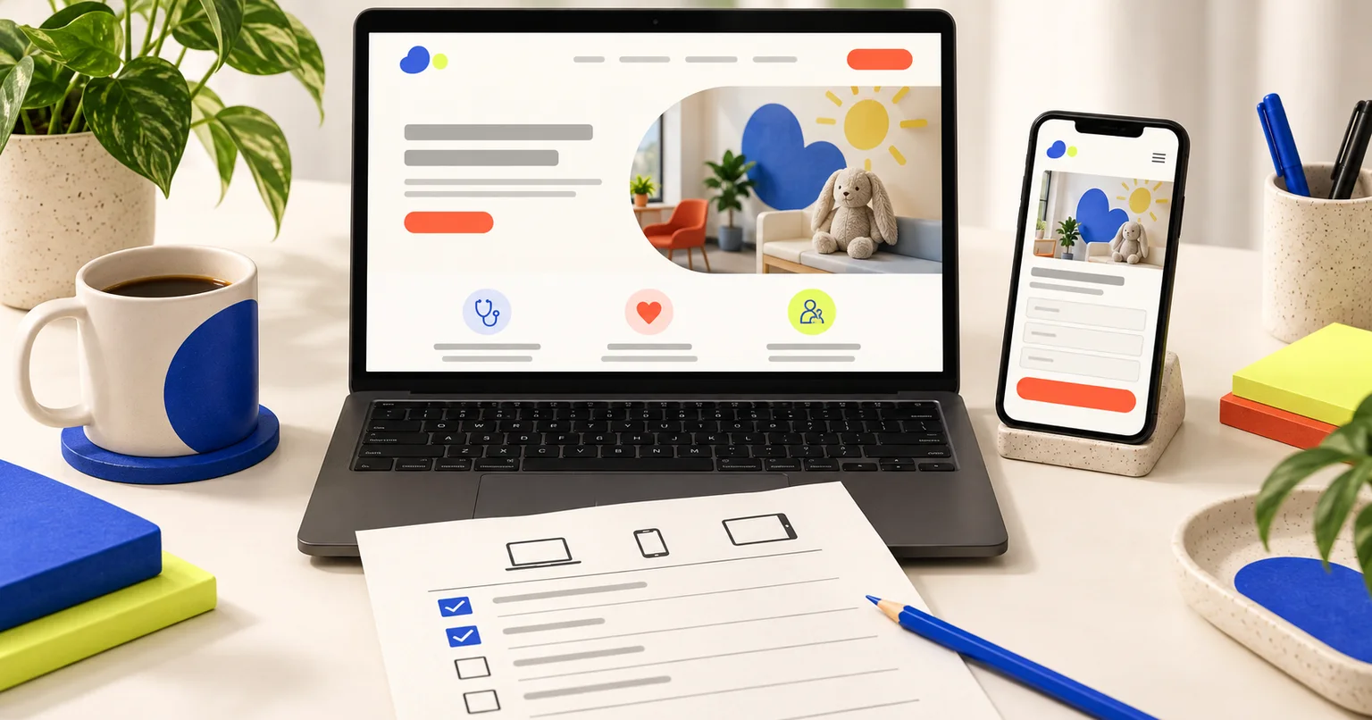
Parents should be able to research your services and contact your team from a phone. Check your own website analytics to understand the devices your visitors use, and test the contact process on a real phone.
Make buttons easy to select, forms easy to complete, and text readable without zooming. Check that the menu, form keyboard, error messages, and submission confirmation work on a small screen.
What to Do About It
Start by looking at your website on your phone. Find a service, check your therapists' credentials, and try the contact process. Ask someone unfamiliar with your practice to do the same and note where they hesitate or need help.
Use what you learn to prioritize clearer content, faster pages, and easier contact steps. Track completed inquiries and staff follow-up before and after changes, using comparable reporting periods. Let your practice's results guide the next improvement rather than assuming a redesign will deliver a particular increase or timeline.