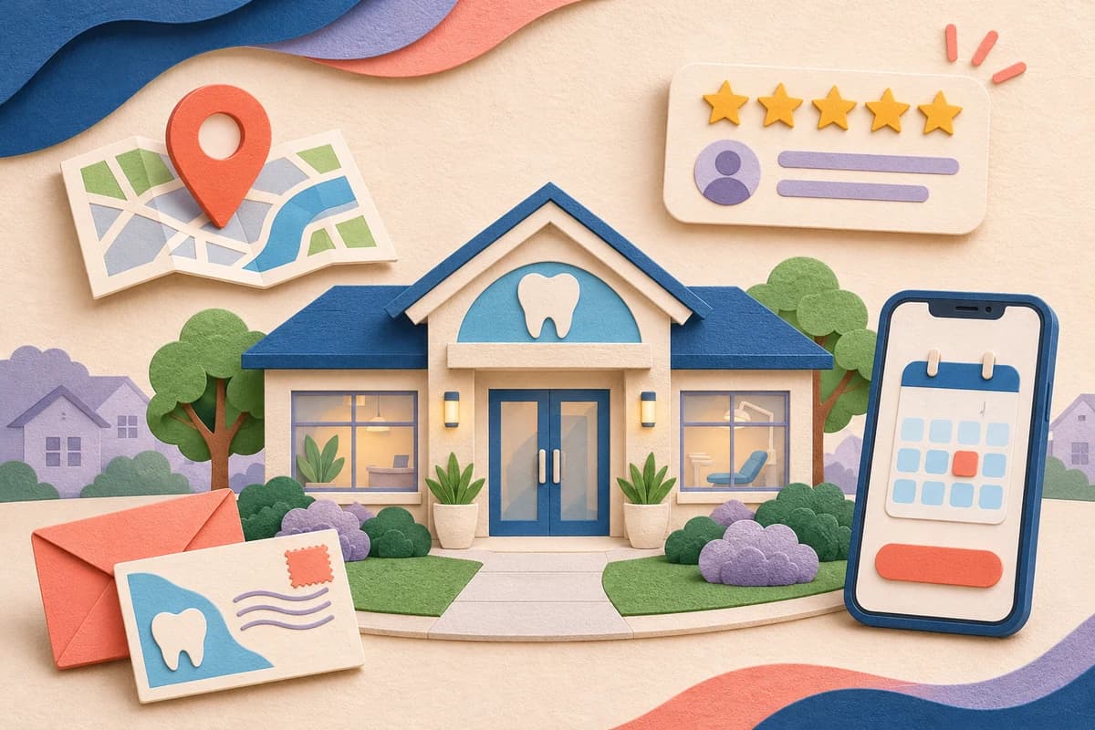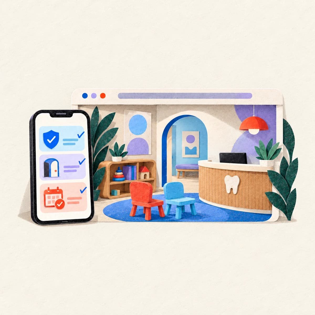
Picture a new patient at 9:40 on a Tuesday night. A filling cracked at dinner, or a cleaning is two years overdue, or a spouse just started a job with new dental insurance. They search on a phone, open three dental websites in three tabs and close two of them within a minute. The one that stays open usually isn't the prettiest. It's the one that answered the next question before they had to hunt for it: do you see adults like me, are you in network with my plan, can I get in this week, and what do I tap?
This guide is for general and family dentists and for the office managers who end up owning the website. It covers what a dental homepage should show on a laptop and on a phone, the pages a general practice needs, how to choose between phone calls, appointment requests and real-time online scheduling, how to word insurance so it's accurate, how to handle emergencies without implying a confirmed time, and how to judge a template, a custom build or a redesign. The layouts and examples below are illustrations we drew for this article. They aren't client sites, and the booking screens are pictures, not working forms.
If you run a kids' office, our pediatric dental website design checklist goes deeper on parents and first visits. For clinics outside dentistry, see our healthcare website design guide. Search and marketing have their own guides: the dental SEO guide covers Maps, citations and treatment-page search, and the dental marketing playbook covers reviews, ads and recall. This page stays on the website itself.
What a dental website has to do
A dental website has three jobs, in this order.
First, it tells the right person they're in the right place. That means the practice type, the town and the kind of patient you see, stated plainly on the first screen. "Family and general dentistry in [town], accepting new adult and child patients" does more work than "Smiles that last a lifetime."
Second, it answers the questions that decide whether someone calls: treatments, dentists, insurance and payment, hours, location and parking. Most of those answers belong on their own pages, linked from the homepage, not crammed into it.
Third, it hands the patient to your team without losing them. That's a tap-to-call link, a request form or an online scheduler, plus a clear statement of what happens next. If that hand-off breaks, nothing else on the site matters much.
Notice what's missing from that list: animation, stock photos of models with perfect teeth, a blog with forty posts. Those can come later. A calm site that does the three jobs well beats a gorgeous one that hides the phone number.
A dental homepage layout, on desktop and on a phone
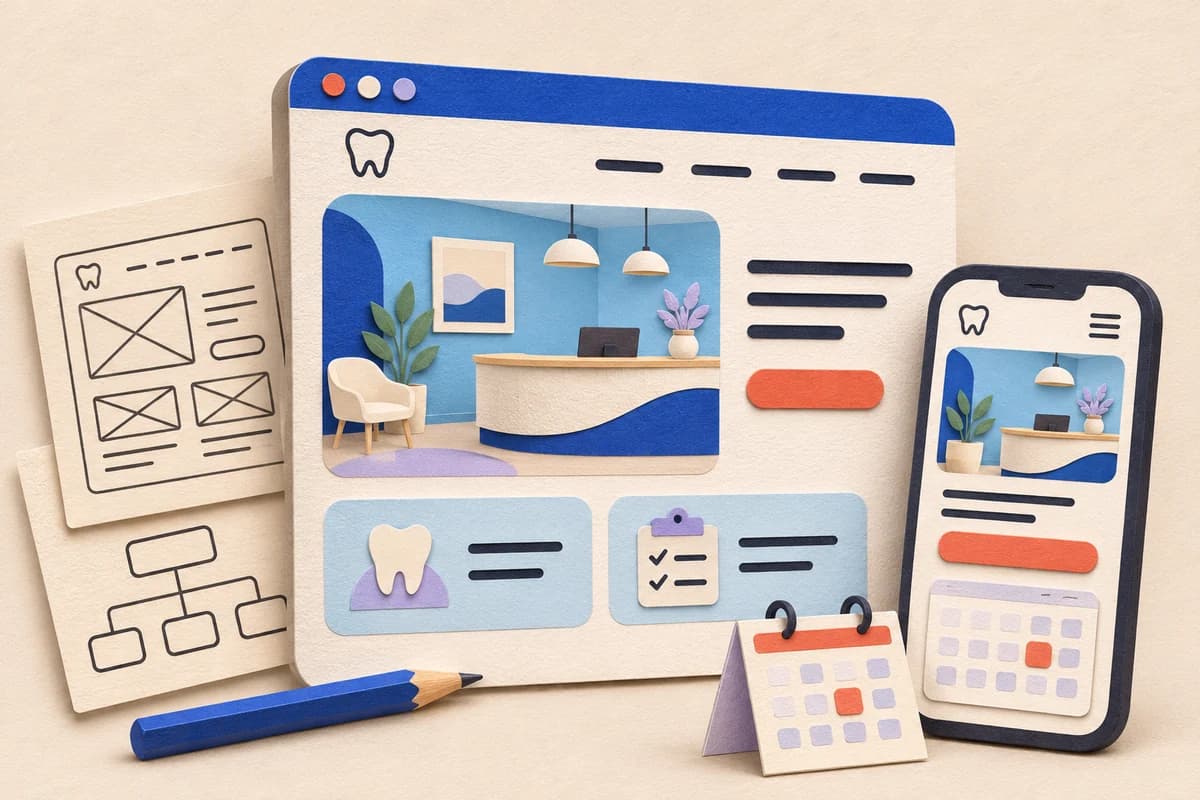
Here's one way to lay out a general practice homepage. It's an illustration, not a client site and not a template you have to copy. The labels show what each block is for.
On a laptop or desktop, top to bottom:
- Header: practice name or logo, the phone number as a tap-to-call link, one primary button (Request an appointment or Book online, whichever your office really offers) and a short menu: Treatments, New patients, Insurance, Our dentists, Contact.
- First screen: one sentence naming the practice type, the town and who you see, a second line saying if you're taking new patients, the primary button and the phone number again. A real photo of the office or the team sits beside it.
- Quick facts strip: today's hours, the address with a directions link and a short insurance line that links to the full insurance page.
- Treatment cards: four to six treatments you want more of, each linking to its own page. For a typical general practice that might be cleanings and exams, fillings and crowns, implants, clear aligners and emergency visits.
- Dentists: a photo, name, degree and one line each, linking to full bios.
- First visit: what happens at the first appointment, what to bring and roughly how long it takes at your office.
- Footer: name, address, phone, hours, links to the privacy policy and accessibility contact, and the same primary button.
On a phone the order shifts. The first screen gets the sentence, the call button and the appointment button, stacked, with nothing competing for attention. The quick facts strip moves up, because hours and address are what mobile visitors look for first. Treatment cards drop to a single column. A sticky bottom bar with Call and the primary action is fine if it doesn't cover content or trap keyboard focus.
Two decisions matter more than any color choice. Pick one primary action and use the same words for it everywhere. And make the phone number real text, not part of an image, so it can be tapped, copied and read aloud by a screen reader.
Pages a general dental practice website needs
A homepage can't answer everything. These are the pages that carry the weight for a general or family practice. A small office can combine a few, but don't drop the questions they answer.
Treatment pages
Give each treatment you want more of its own page: implants, crowns, root canals, clear aligners, dentures, whitening, cleanings and exams, emergency visits. Write it for the patient, not for a colleague. Say who it's for, what the visit involves in plain language, how many visits it usually takes at your office, how cost and insurance usually work for that treatment and what the next step is.
Have a dentist read every clinical sentence before it goes live. Before-and-after photos need written patient permission, and captions shouldn't suggest every patient gets the same result. If a page can't say anything specific about how your office does the treatment, it isn't ready to publish.
New patients and the first visit
Anxious and busy patients read this page twice. Say what happens at the first appointment, what to bring (photo ID, insurance card, a medication list), whether forms can be completed before the visit and how, how early to arrive, where to park and what your cancellation policy is. If you welcome patients who haven't seen a dentist in years, say so kindly. Plenty of adults put off booking because they're embarrassed, and one honest sentence can lower that barrier.
Insurance, payment and financing
Patients check this page before they call, and many calls are really insurance questions. List the plans you're in network with, explain how you handle plans you aren't contracted with, say whether you take Medicaid or your state's dental program, and link to any financing or in-house membership plan with its real terms. The wording matters more than most offices expect, so it gets its own section below.
Dentists and team
Each dentist needs a real photo, their degree, any advanced training stated accurately, languages spoken and a short paragraph that sounds like them. Patients read bios to decide whether they'll feel comfortable, not to check a CV. Confirm every credential with the dentist in writing before launch. If a general dentist places implants or offers aligners, say they're a general dentist who provides that treatment, and don't let the bio imply a specialty they don't hold.
Office, hours and directions
One page with the address, a map, parking and transit notes, access details like step-free entry, hours including lunch closures, and the phone number. If the practice has more than one office, each office needs its own page and its own hours. Blended hours are how patients end up at a locked door.
Emergency dental care
An emergency page should tell people how to reach you during office hours, what to do after hours and when to call 911 or go to an emergency room instead, in wording your dentists approve. It shouldn't promise same-day treatment unless your schedule really holds time for it. It should never rely on a web form alone.
Booking decisions: call, request or real-time scheduling
There are three common ways a dental website hands a patient to the office, and most practices use two of them.
A phone call is still the fastest route for many people, especially for emergencies and insurance questions. It only works if someone answers, or if the voicemail says exactly when you'll call back.
An appointment request form collects a name, a way to reach the person, a preferred time and a general reason for the visit. It's easy to set up, but it isn't a booking. Someone at the office has to reply and confirm.
Real-time online scheduling shows open times from your practice software and lets the patient pick one. It's the clearest experience when it works, but only if the times are real, the appointment types are labeled in plain words and your team is comfortable with what patients can book on their own. Many offices limit online booking to new-patient exams and cleanings and keep longer treatment visits on the phone.
- Patient on your site
- Urgent problem
- Call the office
- After hours: follow the message
- Serious emergency: 911 or ER
- Routine visit
- Call
- Request form. Not booked yet
- Online scheduling
- Office confirms the time
Whatever you choose, the website has to say what happens next.
So the button label and the confirmation message should match reality. "Request an appointment" followed by "We'll call or text you within [your real reply window] to confirm a time" is honest. "Book now" on a form that only sends an email is not. With real-time scheduling, the confirmation screen and the confirmation text or email should show the date, time, address and how to cancel.
Emergencies need their own branch. A patient with a swollen face at 7 p.m. shouldn't land on the same form as someone who wants a cleaning next month.
Put the phone number at the top of the emergency page, say what the after-hours line does and state plainly that sending a form doesn't reserve a time.
Then test the whole route. Send a request with made-up details from a phone on cellular data. Check that it reaches the right inbox, that a person sees it and that the reply window you promised is one your team can keep on a busy Monday.
Insurance wording: "accepted" versus "in network"
Few pages cause more confused phone calls than the insurance page, and it's often because of one word.
"In network" means the practice has a current contract with that plan and has agreed to its negotiated fees. "Accepted" is looser. Many offices use it to mean they'll file a claim for a patient whose plan they aren't contracted with, and the plan then pays whatever its out-of-network benefit allows. Patients often read "accepted" as "in network" and then get a bill they didn't expect.
| What you write | When it's accurate |
|---|---|
| In network with [plan name] | The practice has a current contract with that plan |
| We file claims for many other PPO plans as an out-of-network office | You submit claims for plans you aren't contracted with, and patients may pay more depending on their plan |
| We take [state Medicaid or dental program name] | The practice and the treating dentists are enrolled in that program |
| We don't participate in [plan type] | You don't take that plan type at all |
| Financing through [option] | The terms on the linked page are current |
| Membership plan for patients without insurance | What it includes and what it costs are on the page and match what the front desk says |
A few habits keep this page honest. Have whoever handles billing review the list, add a "last checked" month and recheck it whenever a contract changes. Plan names and networks change. Tell patients to confirm their own benefits with their plan, and say you're glad to help them check. Don't promise what a plan will pay.
Dental website design examples, explained
Galleries of the best dental websites are fun to scroll, but they rarely explain why a layout fits a practice. Here are three illustrative setups for common general practices. They're composites we wrote for this guide, not real offices and not client results.
A family practice in a small town
The lead line names family and general dentistry and the town. The primary action is Request an appointment, because the front desk likes to schedule families together. The homepage puts hours and "accepting new patients" near the top, shows cleanings, fillings, kids' first visits and emergency visits as the main cards and links to a plain insurance page. Watch for a kids' section so prominent that adults assume it's a pediatric office.
A general practice with a lot of implant and restorative work
The lead line still says general and family dentistry, with implants and crowns named as focus treatments. The primary action is Book a consultation, routed to a call or a consult request rather than a self-booked time, because these visits vary in length. The implant and denture pages carry the depth: who's a candidate in plain words, what the visits look like and how payment and financing usually work. Watch for outcome promises and stock smiles that don't look like your patients.
A busy office with evening hours and many same-week visits
The lead line names the town and the extended hours. The primary action is Book online, limited to new-patient exams and cleanings, with emergencies routed to the phone. The quick facts strip shows today's hours. Watch for an online scheduler that offers times the office can't really hold, or appointment types patients can't tell apart.
The pattern across all three is the same. The layout follows how the office actually schedules, not the other way around.
A 16-point dental website audit
Run this with your current site open on a phone. The checks are grouped by the questions patients ask before they book. Tick what's true today, then look at the group with the fewest ticks. That's usually where to start.
Is this the right office for me?
- The first screen names the practice type, the town and who you see.
- Each main treatment has its own page written in plain language.
- The site says if you're taking new patients, and that's current.
- Hours, address and parking are easy to find on a phone.
Can I trust this practice?
- Dentist bios show real photos and credentials each dentist confirmed.
- Office photos are real, and any patient photos have written permission.
- A dentist reviewed the clinical claims, and none of them promise results.
- Someone at the practice checked every fact on the site before it went live.
Can I afford it?
- The insurance page separates in-network plans from plans you file out of network.
- The insurance list shows when it was last checked.
- Payment, financing or membership options link to their real terms.
- The site explains how cost is discussed before treatment starts.
How do I get in?
- One primary action uses the same words on every page.
- The phone number is tappable text on every page.
- Request forms say a person will confirm the time and ask only for what's needed to schedule.
- The emergency path leads with a phone number and doesn't depend on a form.
Score your dental website
Tick what is true for your site today.
Privacy, forms and tracking
This section is general information, not legal advice. HIPAA questions turn on facts about your practice and your vendors, so review the details with your privacy or compliance lead, and with counsel when you need to.
The HIPAA rules apply to covered entities and their business associates. A dental practice is a covered entity if it sends health information electronically in connection with standard transactions such as insurance claims, which describes most offices that bill insurance. A vendor that creates, receives, keeps or sends protected health information on the practice's behalf is generally a business associate, and the practice needs a business associate agreement with it. HHS explains who's covered on its page about covered entities and business associates. Not every tool on your website is a business associate, and not every form touches health information. What matters is the data the tool actually receives.
A public brochure site doesn't have to collect clinical details, and for most general practices it shouldn't. A few practical habits:
- Keep the public request form to scheduling basics: name, phone or email, preferred time, and new or existing patient. Add a line asking people not to include medical details.
- Collect health history, medications and insurance card images through your practice software, a patient portal or an intake tool your privacy lead has reviewed, with a business associate agreement in place when one is required.
- If an online scheduler or chat tool will receive appointment details tied to a person, review it the same way as any other vendor that may handle protected health information.
- Check which analytics and advertising scripts run on scheduling pages, request forms and portal login pages, and decide with your privacy lead what belongs there.
HHS guidance on online tracking technologies says the HIPAA rules apply when tracking tools on a regulated entity's website collect or disclose protected health information, and it uses appointment scheduling as an example of where that can happen. In 2024 a federal court vacated one part of that guidance, the part about tracking that only connects an IP address with a visit to a public page about health conditions or providers, and HHS notes this at the top of the page. Read the HHS page itself with your privacy lead rather than relying on a summary, including this one.
One habit is simple to follow no matter what: don't build ad audiences from people who visited treatment pages, or from patient lists that reveal health information. Also publish a website privacy policy that describes what the site really collects, and link your Notice of Privacy Practices where patients can find it.
Mobile, speed and accessibility
Most new patients meet your site on a phone, often one-handed. Test on a real device: tap targets big enough for a thumb, text that reads without zooming, nothing that scrolls sideways and a call button that's reachable on the first screen.
For speed, Google's Core Web Vitals give concrete targets. Largest Contentful Paint should happen within 2.5 seconds, Interaction to Next Paint should be 200 milliseconds or less and Cumulative Layout Shift should be 0.1 or less, as web.dev describes. On dental sites the usual culprits are hero videos, image sliders and a pile of third-party widgets. Compressed real photos do the job better.
Accessibility helps every patient, including people who are older, in pain or using a screen reader. The Department of Justice's guidance on web accessibility lists common barriers: poor color contrast, color as the only signal, missing alt text, videos without captions, forms without labels or clear error messages and menus that only work with a mouse. The Web Content Accessibility Guidelines, WCAG 2.2, are the usual technical reference. Fix the basics, test with a keyboard and a screen reader and give people a way to report a problem. No checklist or overlay can promise legal compliance, and this one doesn't either.
Keep the website and Google Business Profile in agreement
Your website and your Google Business Profile should describe the same practice. Google's guidelines ask businesses to represent themselves the way they're consistently represented and recognized in the real world, across signage and other branding. In practice, the name, address, phone number and hours on your site should be accurate and consistent with the profile and with the sign on the door. "Suite" versus "Ste." isn't the problem. A wrong suite number, an old phone line or hours that disagree are.
Google says local results are mainly based on relevance, distance and prominence. Clear treatment pages and accurate categories help relevance. Nobody controls distance. Prominence builds over time through things like reviews and links from other sites. Point the profile's website link at the homepage or the right office page, and point its appointment link at a page that works on a phone.
For the Maps side, including categories, reviews and citations, use the dental SEO guide. If you're rewriting review requests on the site or in follow-up texts, read our Google review policy guide first.
Template, custom build or redesign
Owners usually choose among three paths, and none is right for every practice. Dentist website templates aren't a mistake. They become one when the template decides your page structure instead of your patients do.
| Question | Template site | Custom build | Redesign of your current site |
|---|---|---|---|
| Best fit | A newer or smaller practice that needs a clean, accurate site soon | A practice with several focus treatments, specific booking rules or a brand it wants to own | A site with good content and search history but a dated look or a broken booking path |
| Treatment page depth | Limited by the template's layouts | Planned page by page around the treatments you want | Keeps pages that already work and rebuilds weak ones |
| Booking | Whatever the template's plugins or embeds allow | Built around how your office schedules | A chance to fix the hand-off without starting over |
| Existing search traffic | At risk if URLs change without redirects | Same risk, so it needs a redirect map | Lowest risk when URLs and content carry over |
| Ownership | Check that you can export the site and keep the domain | Confirm in the contract that you own the code, content and accounts | Confirm who holds the logins before work starts |
| Main risk | Looking like every other office on the same theme | Paying for design without fixing the patient path | Carrying old problems into a new look |
Signs a dental website redesign is worth it
- Nobody can edit the site without a developer, or nobody knows the logins.
- Phone users can't find the number or the appointment button on the first screen.
- Treatment pages don't exist, or each one is a single paragraph.
- The booking path is broken or confusing, and the current platform can't fix it.
- Facts on the site are wrong and hard to update.
Signs a fix list is enough
- Pages already rank and bring calls, but the insurance page and bios are stale.
- The structure is sound, and the problem is mostly photos and copy.
- Booking works, and only the wording around it is unclear.
If a custom build makes sense and you work with us on web design, our websites usually launch in about one week once content and scope are settled. You own the site, the domain, the accounts and the content.
What drives dental website design cost
Dental website design cost depends on scope far more than on visual style. These are the things that move it most:
- How many treatment pages you need, and who writes them.
- Whether you have real photos or need a shoot.
- How many dentist and team bios there are.
- Booking: a simple request form, or a connection to your practice software or scheduler.
- Moving off an old site, including redirects for pages that already get search traffic.
- Content in more than one language.
- Accessibility review and testing.
- Edits after launch, and who makes them.
When you compare quotes, compare the page list and the booking setup, not just the total. A cheaper quote that leaves out treatment pages or redirects often isn't cheaper by the end. Driftlss publishes its prices, so you can see pricing for our website and marketing plans on the services menu. When a website build is billed on its own, payment is 50% upfront and 50% at launch.
Questions to ask a dental website design company
- Who owns the domain, hosting, code, content and accounts during and after the project?
- Which pages are included, and who writes them?
- How will booking work with our practice software and our front desk?
- How will you handle redirects from our current site?
- What scripts will run on our forms and scheduling pages, and will any vendor need a business associate agreement?
- How do you test accessibility and mobile speed before launch?
- What does editing look like after launch?
A dental website designer worth hiring will answer these plainly and in writing.
Launch QA checklist
Run this the week before launch on a phone and a laptop, with someone from the front desk in the room.
- Every phone number is tappable and rings the right line.
- Every request form submits, reaches the right inbox and shows the confirmation message you wrote.
- Online scheduling, if you use it, shows real times and the right appointment types.
- The emergency page leads with a phone number and tells after-hours callers what to do.
- The practice checked hours, address, dentists' names, credentials and insurance plans in writing.
- Name, address, phone and hours agree with the Google Business Profile and the sign on the door.
- Old URLs that had traffic redirect to the closest new page.
- Each page has its own title and description, and the sitemap lists the pages you want found.
- Search Console and analytics are connected, and scripts on form and scheduling pages were reviewed with your privacy lead.
- Keyboard users can reach the menu, buttons and form fields, and focus is always visible.
- Images have useful alt text, and videos have captions.
- Pages load quickly on a mid-range phone over cellular data.
- The privacy policy, Notice of Privacy Practices and accessibility contact are linked in the footer.
- The practice holds the logins for the domain, hosting, website editor and form tools.
Common dental website mistakes
| Mistake | Why it costs you |
|---|---|
| "Book now" on a form that only sends an email | Patients think they have a time, then miss it or call upset |
| "We accept all insurance" | Sets up surprise bills and hard conversations at the front desk |
| One Services page for every treatment | No page answers the search a patient actually typed |
| Stock photos of models | Patients can't picture your office or your dentists |
| Emergency visitors sent to the general form | Urgent patients wait, or go somewhere else |
| Phone number inside an image | It can't be tapped, copied or read by a screen reader |
| Website hours differ from the Google profile | Patients arrive at a closed office |
| Bios that imply a specialty | Misleads patients and can conflict with dental advertising rules |
| Scripts and chat on forms nobody reviewed | Privacy risk on pages that may handle health information |
| Logins held by a former vendor | Small edits turn into projects |
Dental website design questions
What is dental website design?
Dental website design is the planning, writing and building of a practice website that helps new patients decide and act. For a general practice that means a clear homepage, a page for each main treatment, honest dentist bios, accurate insurance wording, office details and a booking path with a separate emergency route.
What pages should a dental practice website have?
Most general practices need a homepage, treatment pages, a new patient and first visit page, an insurance and payment page, dentist bios, an office page with hours and directions, an emergency page, a contact or appointment page and a privacy policy with a link to the Notice of Privacy Practices.
Should a dental website use online booking or a request form?
Use what your office can honor. Real-time scheduling works when the times shown are real and the appointment types are clear. A request form works when someone replies within the window you state. Either way, say what happens next, and keep emergencies on the phone.
How should a dental website list insurance?
Separate plans you're in network with from plans you file as an out-of-network office, say whether you take Medicaid or your state program, and add a last-checked month. Have billing staff review the list and ask patients to confirm their own benefits.
Does a dental website need to be HIPAA compliant?
HIPAA applies to covered entities and business associates and to the protected health information they handle, not to every page or tool. Keep public forms to scheduling basics, collect clinical details through reviewed tools with a business associate agreement when required and review tracking on form and scheduling pages with your privacy lead. This is general information, not legal advice.
Are dentist website templates good enough?
They can be for a newer or smaller practice, as long as you can add real treatment pages, keep the booking path clear, export your content and keep your domain. Choose custom work when your treatments, booking rules or brand need a structure the template can't hold.
When is a dental website redesign worth it?
When nobody can edit the site, phone users can't find the number or appointment button, treatment pages are missing or the booking path can't be fixed on the current platform. If the site already brings calls and the structure is sound, a focused fix list is often enough.
How much does dental website design cost?
Cost follows scope: the number of treatment pages, who writes them, photography, booking connections, redirects from an old site, languages and testing. Compare quotes by page list and booking setup. Driftlss publishes its prices, so you can see pricing on our services menu.
What should I ask a dental website design company before hiring?
Ask who owns the domain, code, content and accounts, which pages are included and who writes them, how booking and redirects will work, what scripts will run on forms and scheduling pages, how accessibility and speed are tested and how edits work after launch.
Sources we checked
- HHS: Covered Entities and Business Associates
- HHS Office for Civil Rights: Use of Online Tracking Technologies by HIPAA Covered Entities and Business Associates
- Google Business Profile Help: Tips to improve your local ranking on Google
- Google Business Profile Help: Guidelines for representing your business on Google
- web.dev: Web Vitals
- ADA.gov: Guidance on Web Accessibility and the ADA
- W3C: Web Content Accessibility Guidelines (WCAG) 2.2
Want help with your dental website?
If you'd like a dental website built around your treatments, your booking rules and facts your team has checked, tell us about your practice. You can see pricing on our services menu first. Clients own their site, domain, accounts and content.